Brand Architecture / Visual & Verbal Identity / Art Direction / Motion Design / Illustration / Retail Space Activation

Embracing Curiosity

Cycle Solutions has built significant standing in the B2B cycle to work market by providing a quality service and unwavering commitment to employees across the corporate world. With a solid infrastructure and a team full of passion their vision was to deliver the same experience direct to riders at retail and they asked us to support with consultation, creative and implementation.

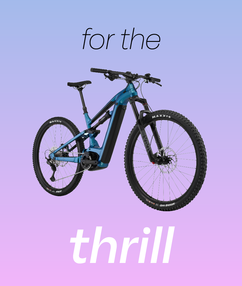
Creating a new retail focussed brand, Uprise; we pointed their undeniable passion directly towards people, delivering energy, expertise and honesty through a brand experience which supports riders and doesn’t simply convert them. Harnessing the experience of being on two wheels – for the first time and every time – was the keystone of the creative.

Opportunity for growth

Working with their internal team we defined a new architecture to support the two business streams, separating and creating ownership for the B2C business through Uprise – allowing both to refocus their offerings, tone, communication and ultimately flourish.

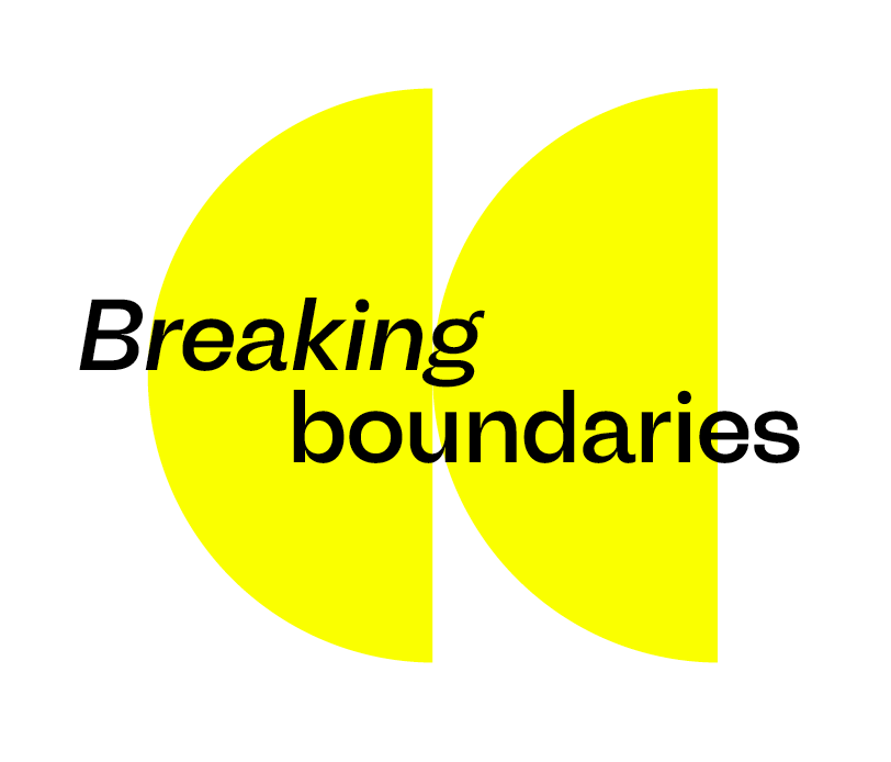
Positioning and developing a tone for the new brand which retained their rich history, whilest also crafting a compelling narrative that would capture a diverse audience was key to the brand strategy.

A drawing of a globe with a bicycle leaning against it, featuring simple black and white lines and minimal details. motion design, animation, graphic animation
16. Inspirational quote graphic with ‘UPRISE’ button, designed as motivational campaign asset and brand messaging visual.
A small dog wearing a black helmet with a sticker that says 'HELMET LAWS SUCK', sunglasses, and a black vest, sitting on a leopard print surface outdoors.
Text saying 'One Less Car' with a globe and bicycle illustration above. Graphic, campaign creative for sustainable brand identity.
Aerial view of a winding road through a forest with messages overlaid: '20000 miles' at the top and 'of gravel' inside a yellow semicircle at the bottom.

At the heart of this transformation is an energised colour palette featuring a contemporary gradient symbolising inclusivity, adventure and movement.

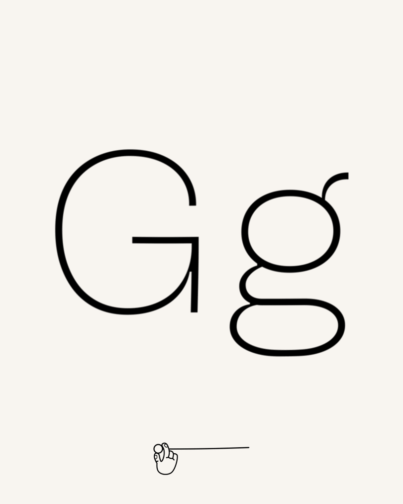
Quirky typography adds a playful personality to the brand's communication, while illustrations and animations breathe life into content, showcasing cyclists of all backgrounds and infusing energy into the brand's online presence.

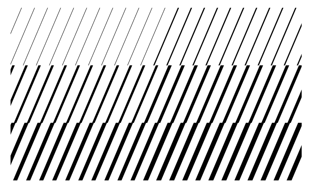
Energised patterns further enhance the visual language, representing the rhythm and motion of cycling.

Two cardboard boxes labeled "Uprise Bikes" with black barcode designs and a yellow sticker with a black letter "U" on one box, placed on a flat surface with a plain gray background.
Two cardboard boxes, one open and one closed, from Uprise Bikes, with the open box showing a note that reads 'Wanna go on a bike ride?' Innovative packaging design that blends brand identity, storytelling and functionality
Back view of a person wearing a white T-shirt with the word 'UPRISE' printed on the upper back. Custom brand merchandise design that transforms branded products into memorable touchpoints.
A person wearing a white T-shirt and wearing a blue cycling cap with the word "UPRISE" written on it. Brand merchandise design that transforms branded products into memorable touchpoints.
Two upcycling drawstring laundry bags with a purple to blue gradient. Innovative packaging design that blends brand identity, storytelling and functionality.
Concept design of a bicycle display in a store with a photo of a cyclist and bicycles on elevated platforms and a person pointing at the display.

Retail Space Activation

When envisioning Uprise stores, we wanted to extract the spirit of the brand in a physical, immersive space. We brought the brand’s vibrant and playful character to life by transforming ordinary industrial materials into store features. Embracing a straightforward material palette, our intention was to create a minimalist backdrop that elevates the showcased bicycles to the forefront.

Recognising the importance of adaptability, we ensured that the store design could effortlessly evolve with the brand's needs. We designed display fixtures with movement in mind, allowing staff to effortlessly reshape the store layout for new products, launches or special events.

Display of mountain biking gear including bikes, helmet, backpack, and accessories at a retail booth with a sign reading "Ultimate MTB Bundle" and a large image of a cyclist
A digital illustration of a modern reception area with a bicycle parked nearby and a large sports-themed poster on the wall. The space features a minimalist design with a light-colored counter, glass walls, and ceiling lights, with two people interacting in the background.
A promotional display for UPRISE BIKES with bikes on stand, a van with branding, a tent, and digital screens showing racing scenes, with two people walking past.
A vertical blue banner with the word 'UPRISE' in bold black letters hanging from a ceiling. Branded signage design that unites wayfinding, identity, and visual storytelling.
An electric mountain bike attached to a display stand in front of a sign that says 'Explore new routes' with an image of a cyclist on a mountain top.
Two vertical fabric flags with black poles and bases, one with the text "Stay Curious." and the other with the text "UPRISE" on a purple and blue gradient background. Branded signage design that unites wayfinding, identity, and visual storytelling.