Storytelling / Tone of Voice / Communication / Identity Design / Motion Design / Campaign / Illustration
Unapologetic Cravings
Frocco is an ice cream brand born out of a desire to explore identity through the lens of flavour, emotion, and chaos. Inspired by the romance and heat of Italian summers, Frocco embraces maximalism and play with a brand world that leans into spontaneity, craving, and the beautiful mess of indulgence.
The concept draws on elements of la dolce vita - striped umbrellas and vintage beach culture - while twisting it with a tone of voice that’s unfiltered, sassy, and deliberately a little unhinged. Here, emotional eating is an aesthetic, not a guilty pleasure.


A brand made to melt
Frocco blends expressive design with vintage flair, channelling the playful chaos of an Italian summer in full emotional meltdown.
Flavour leads the colour story - bold and pastel yellows for banana, deep cocoa and soft pinks for chocolate, rich greens and airy pistachios. The palette strikes a balance between indulgent and inviting, giving the brand warmth without losing its edge.
Typography brings structure with narrow, bold serifs - nodding to retro Italian signage - while the custom logotype adds movement and mischief. Designed to drip, stretch, and melt in motion, it mirrors the product and the feeling: soft, sweet, and a little unhinged.
Cheeky illustrations and loud, emotionally charged copy inject Frocco with its true attitude - indulgent, unapologetic, and gloriously over the top. This is a brand that celebrates craving, chaos, and the art of not holding back.


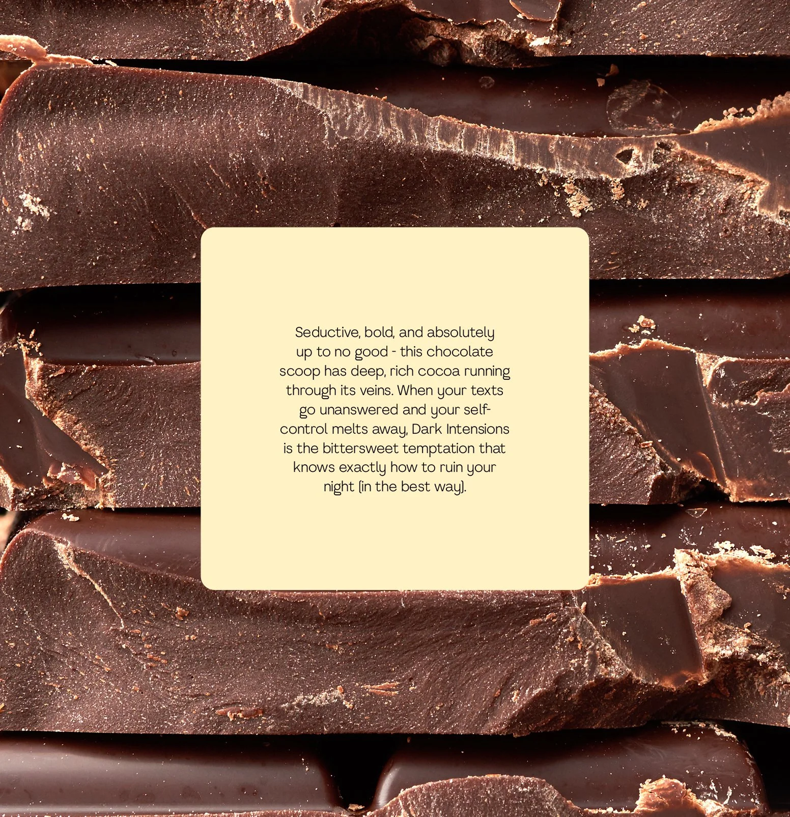
Frocco’s tone of voice is intentionally bold, using dark humour and emotional honesty to reflect the kind of joy that’s found in messy moments - the cone that melts too fast, the flavour that’s a little too intense, the craving you didn’t try to fight.
From packaging to motion, Frocco leans into the joy of craving - flavour-first and unfiltered. It’s not just ice cream; it’s emotional release, served cold.