

Brand Research / Brand Strategy / Storytelling / Identity Design / Campaign
Redefining Legacy
J. Rotherham stands prominently as one of the leading worktop manufacturers in the UK – distinguished by a legacy of quality, authenticity and a commitment to creating luxury surfaces. Whilst their reputation was continuing to grow, the presentation of the brand felt dated and they approached us with a vision to modernise and revitalise.
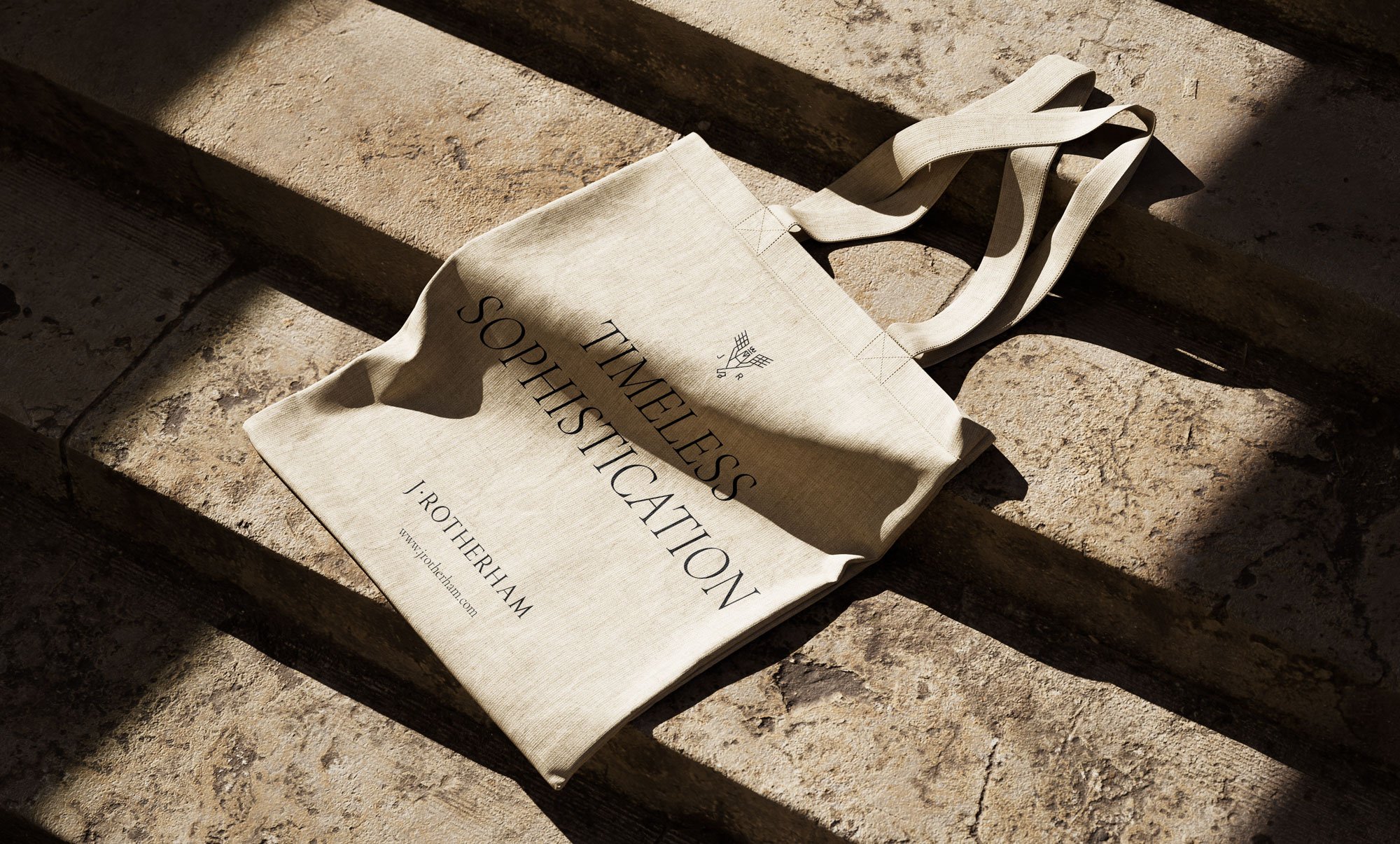
Beginning with a strategic overhaul of J. Rotherham's visual identity, we brought a modern expression to the brand, conveying the inherent excellence of its products as well as bringing clarity to its diverse product portfolio. Their symbol, the griffin, which had been synonymous with the brand throughout their history underwent a transformative evolution, emerging as a sleek, modern emblem.


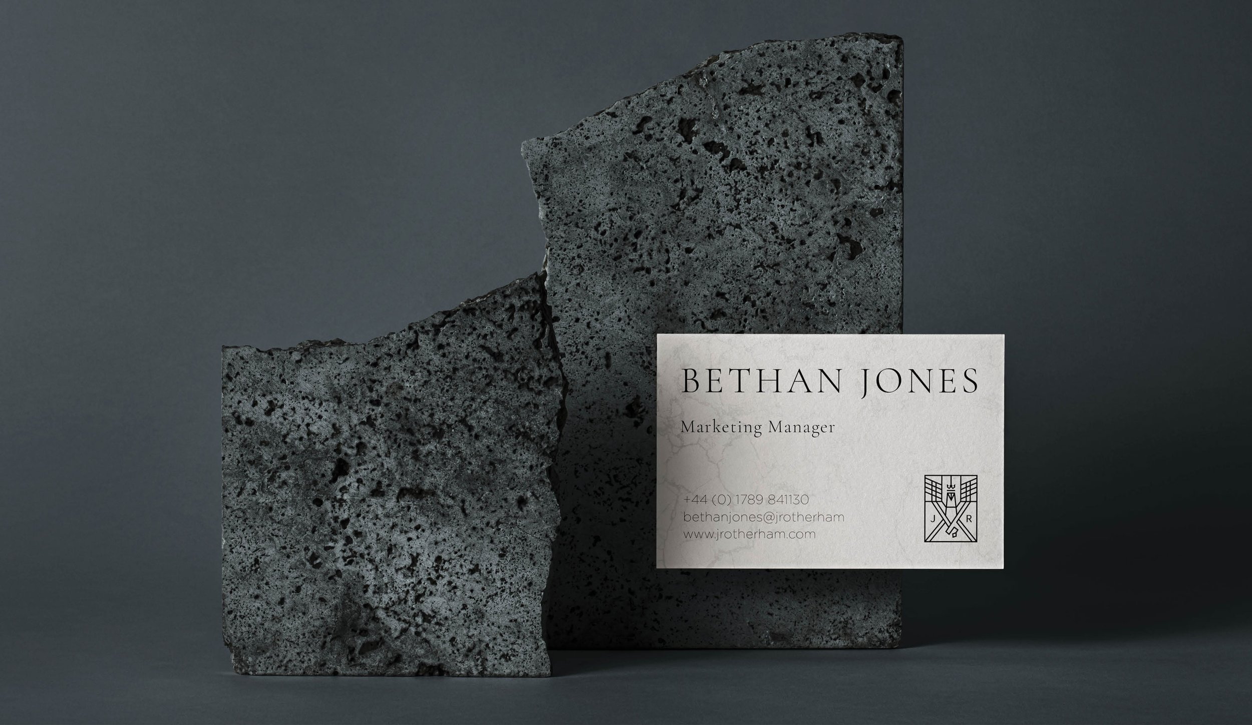
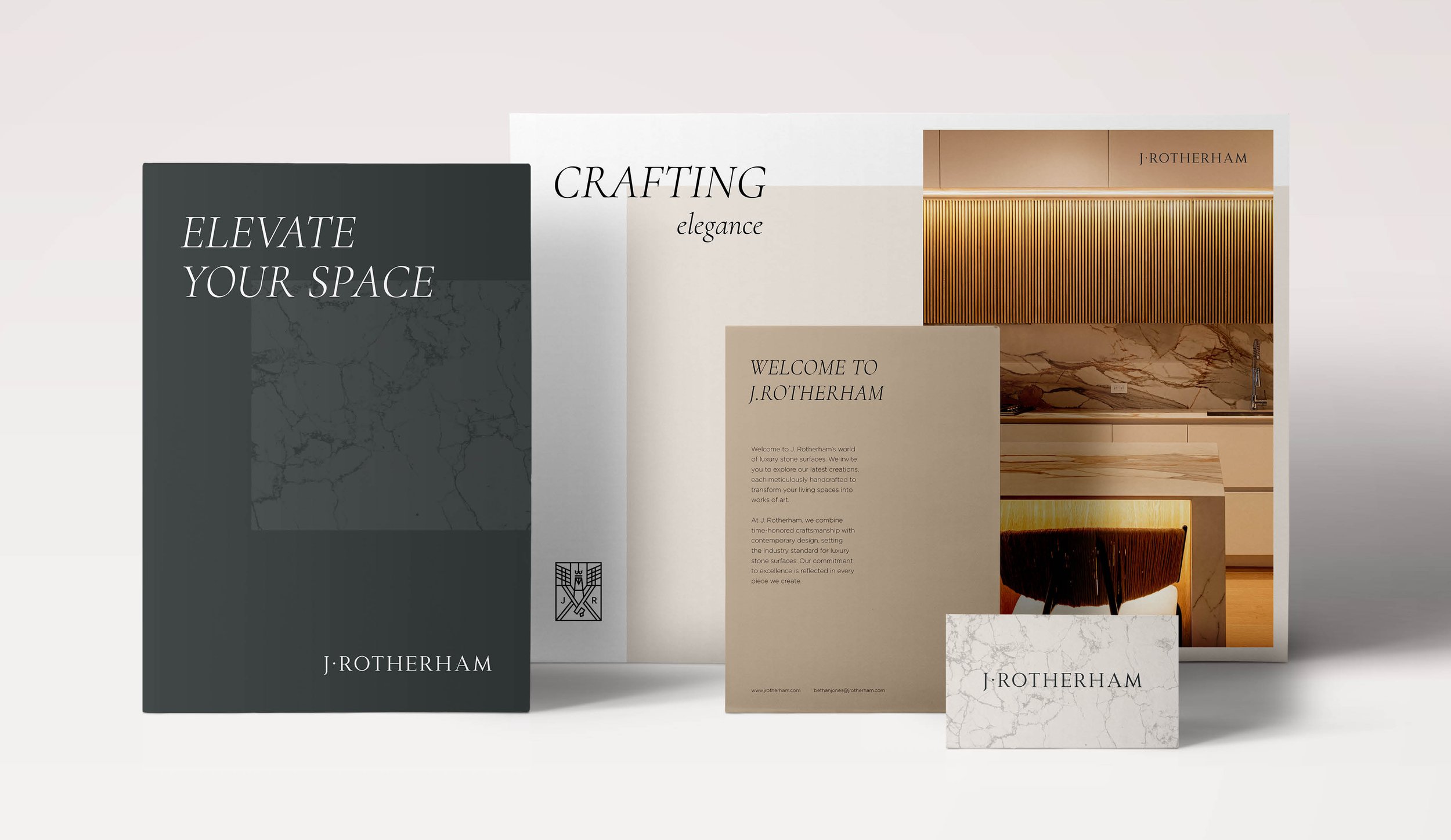
The transformation went beyond the logo and other brand elements. Through the creation of a timeless colour palette coupled with elegant typography and modernised graphical elements, a sense of character was instilled into the brand across all touch-points.
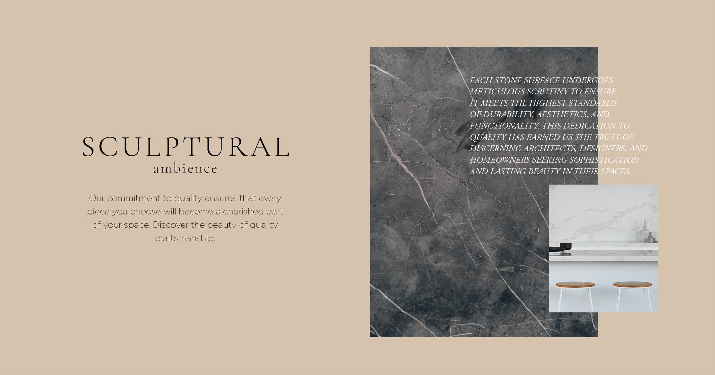
This strategic redesign allowed the product photography to shine, placing the craft and skill at the forefront of the brand, infusing the visual language with the sophistication the brand had come to embody.


The introduction of a biannual magazine and digital content marked a dynamic shift in how the brand approached customer engagement. Providing a canvas to both illustrate their knowledge of the industry as well as encourage customer dialogue, it allowed them to better share their craft, discuss the latest interior trends and conduct interviews with architects and interior designers, unveiling the creative minds shaping the industry. In essence, the magazine transformed J. Rotherham into more than a worktop provider—it became a curator of design narratives, a beacon of inspiration, and a trusted guide in the dynamic world of interior design.


Next Project→
